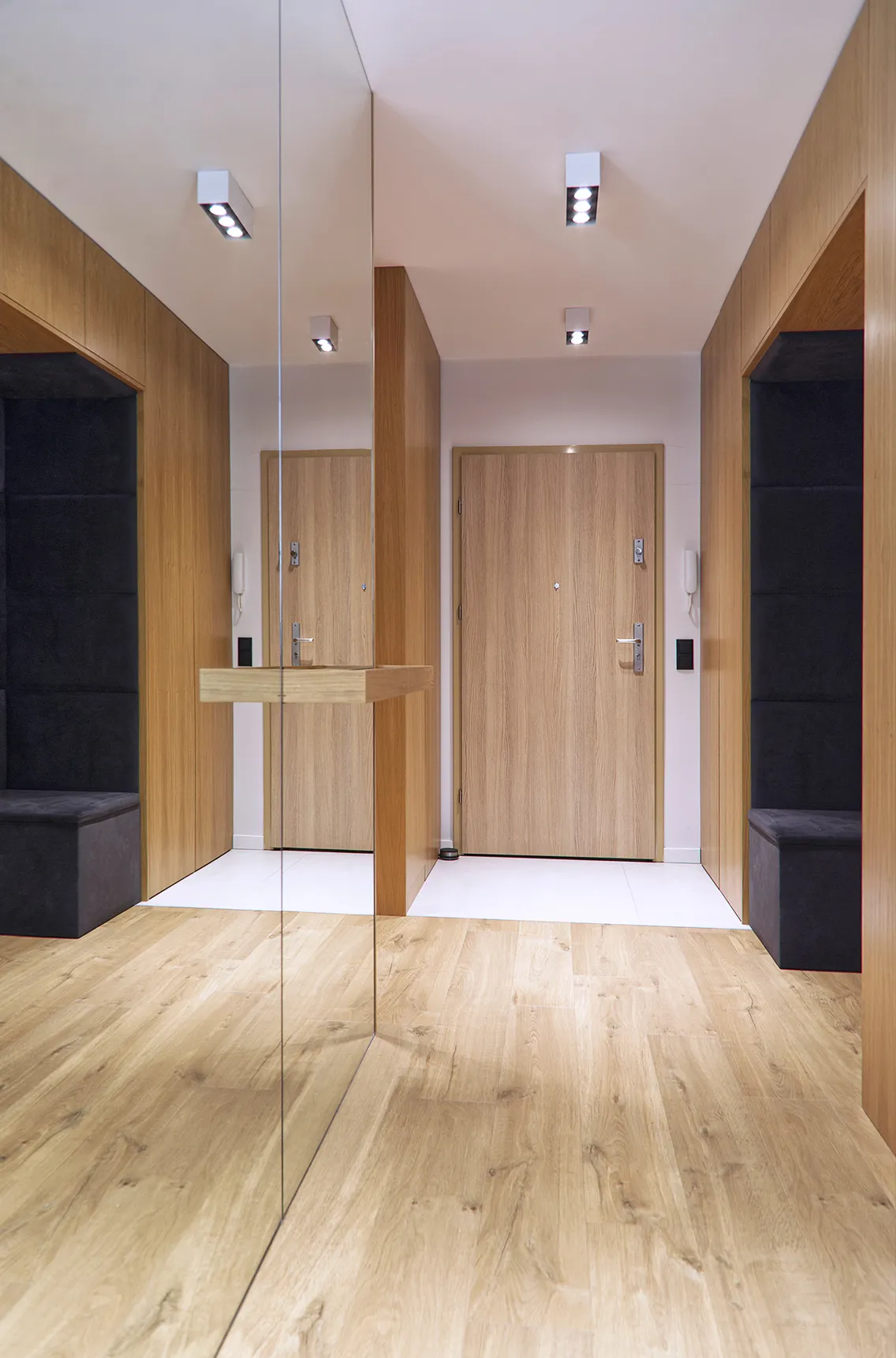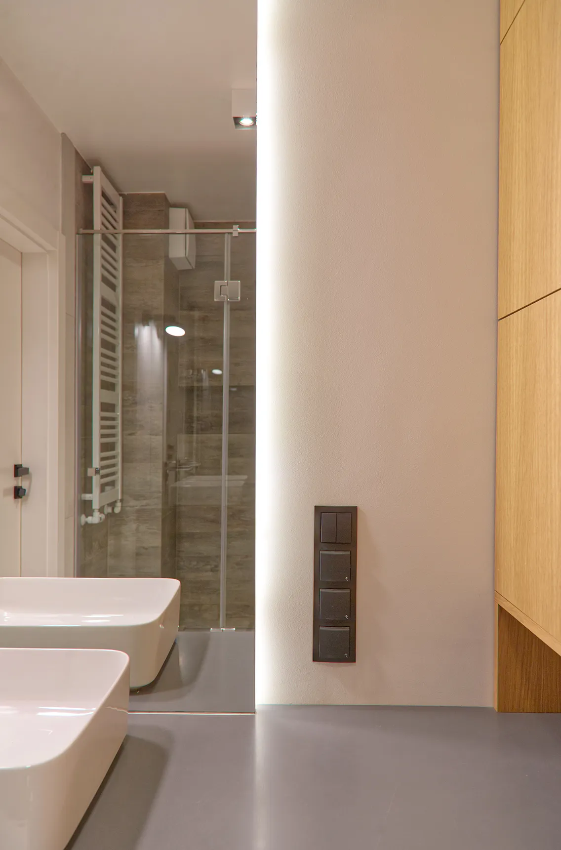
Hiatus is a synonym for contrast — and contrast also defines the interior of this apartment, which we designed for a growing family of four.
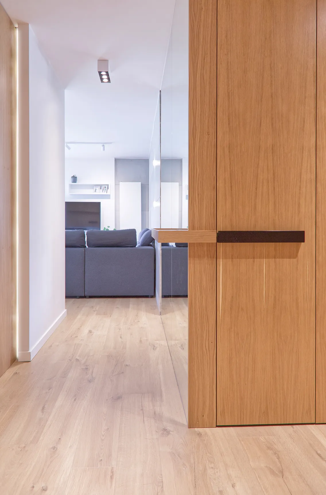
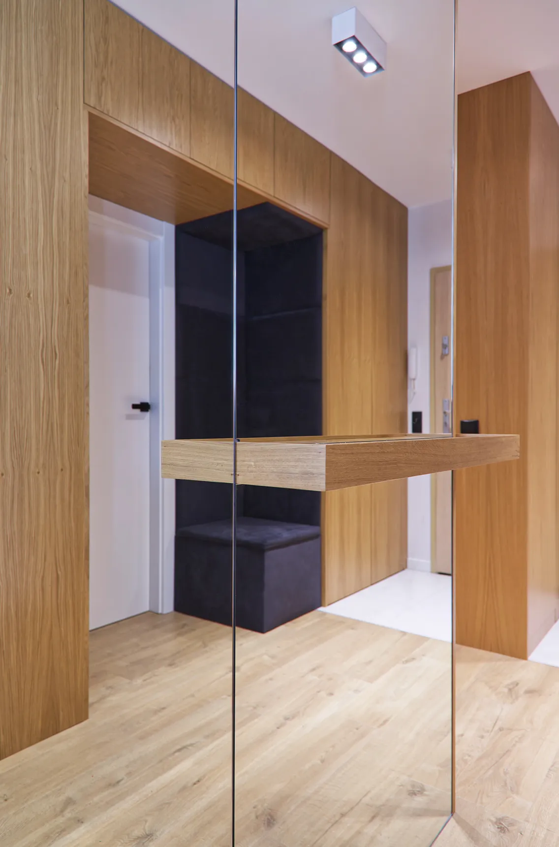
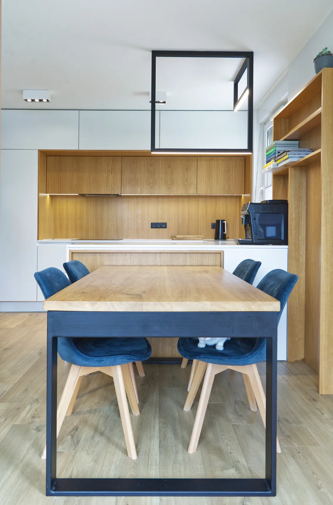
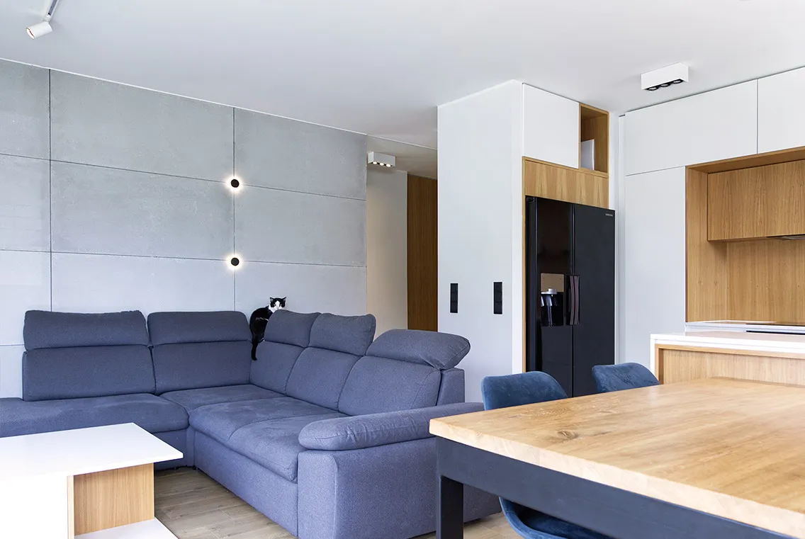
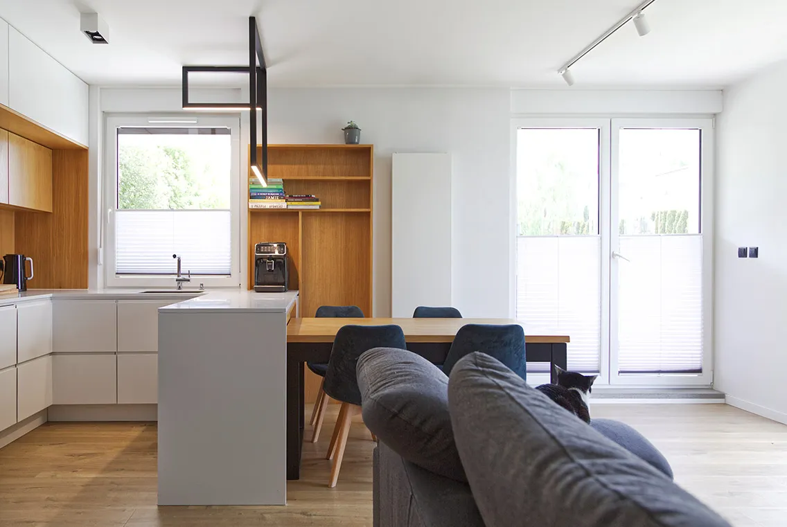
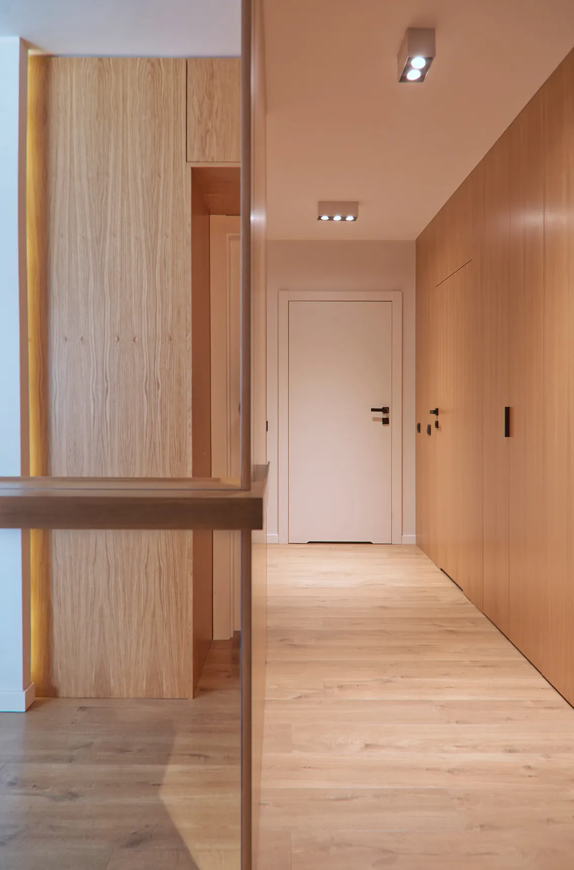
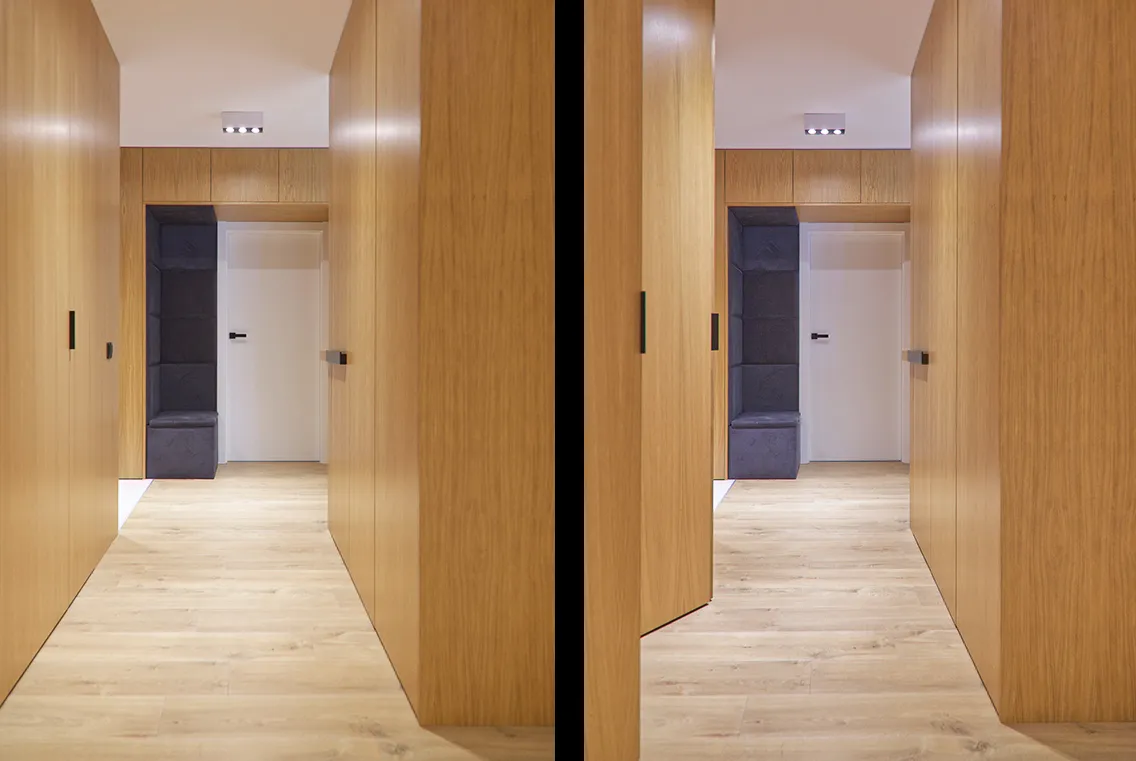
Because of their changing family situation, the clients’ main need was as much storage as possible. They wanted mostly closed, opaque storage. We met this need primarily with spacious wardrobes with angled fronts and fully fitted kitchen units with an island. We also created a utility area for the washing machine and dryer within the hallway units. This allowed for a freer, lighter design of the bathroom and toilet.
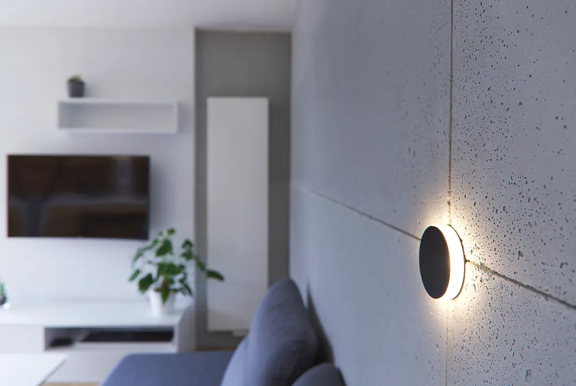
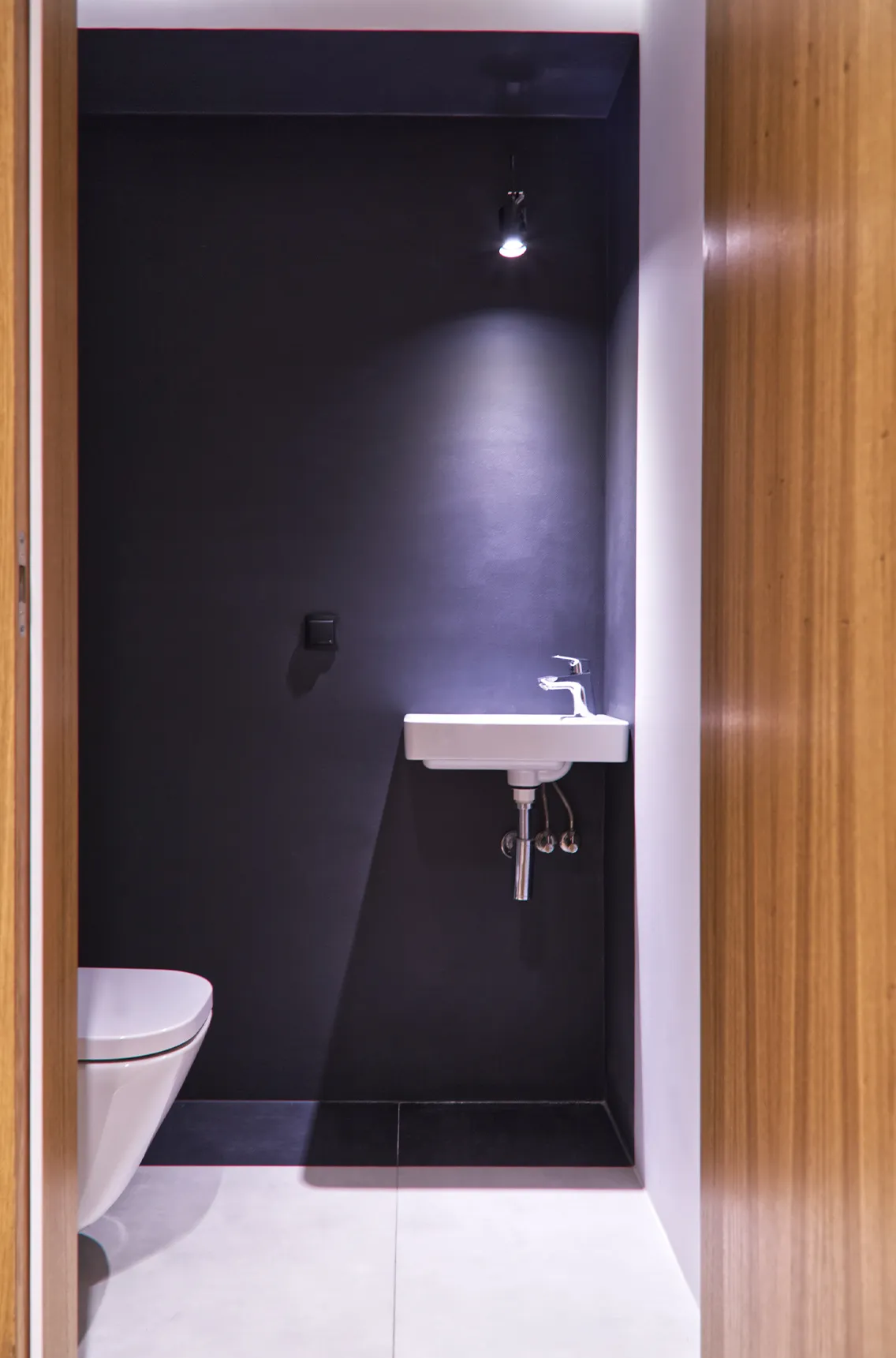
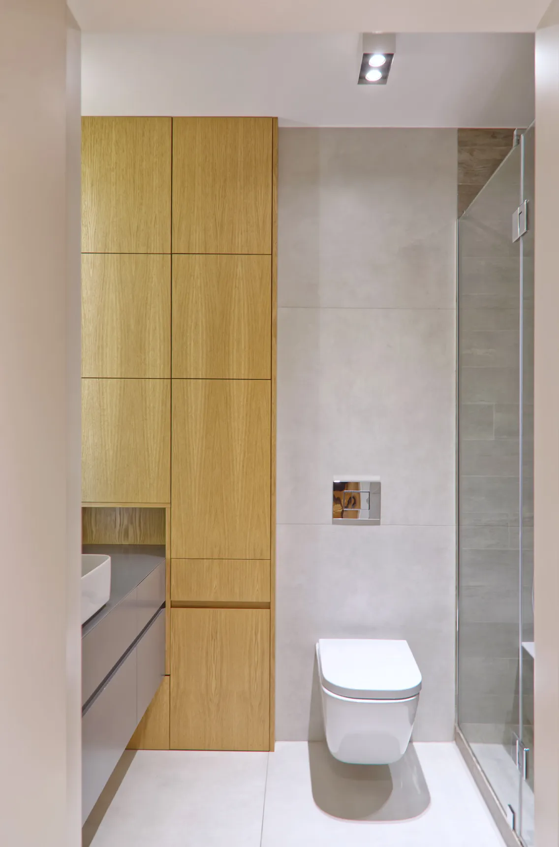
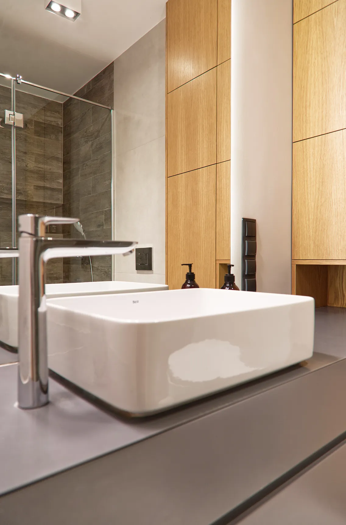
As for the character of the interior, the clients wanted warmth, plenty of light and no monotony. And this is where we began our play of contrasts. We combined materials that are in theory opposites so that they interweave and complement each other. We also gave them an extra role: they gently define the zones of the apartment. Oak veneer dominates the hallway, gradually fades out in the kitchen and appears only as an accent in the living room, where concrete takes the lead. Colour matters just as much. The smooth white of the kitchen reflects plenty of natural light, blue upholstery links the living room with the dining area, warm greys relax you in the bathroom, and simple black accents create the desired dynamism.